![]()
Challenge
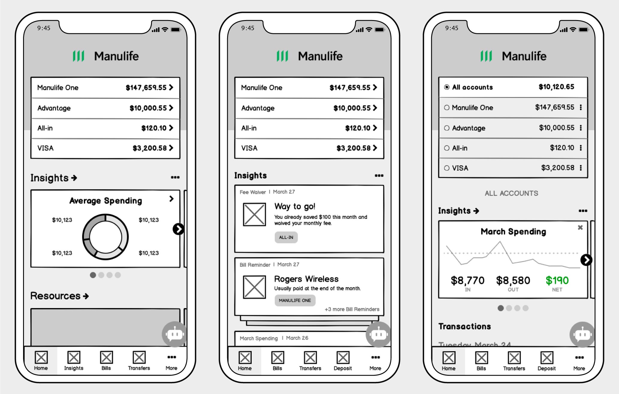
My first task after joining the Manulife Mobile Banking squad was to design an experience for the app that allows customers to quickly and easily view, manage and take action on personalized financial insights.
Insights reveal a piece of financial wisdom that would not be readily knowable by our customers without a good amount of work on their part. Insights can be informative or directly actionable by customers—giving them the ability to make better/faster decisions, understand why they are making them, and feel confident that they are making good financial choices.
The technology for generating personalized insights had already been selected before starting the design work, so we worked to maximize it’s capabilities in the experience.
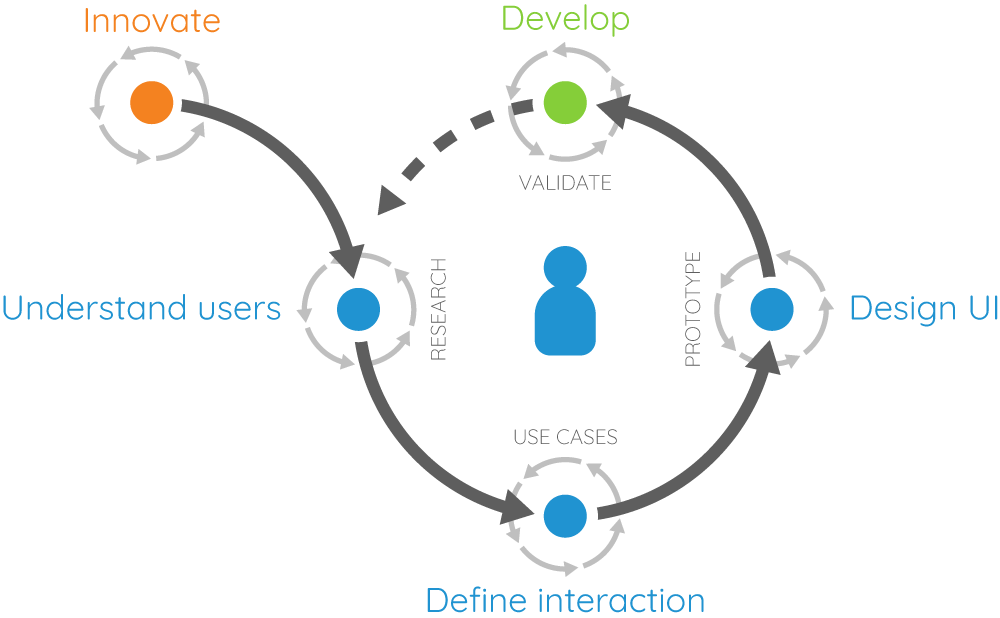
Process
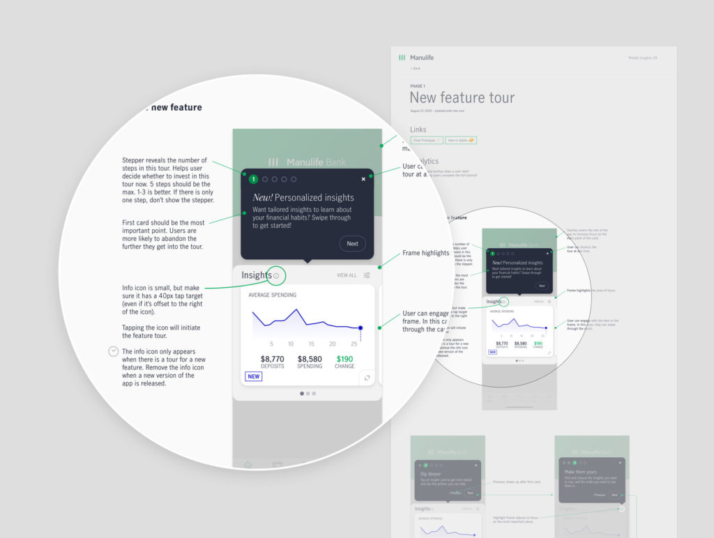
Getting started on my first feature with the new team gave us the opportunity to formalize a working process and showcase what’s possible when following a user-centered process.
- Determine the problem
- Define the experience
- Identify success criteria
- Outline the user journey
- Rapid prototype and test
- Refine and test
- Finalize design
- Document
At key points throughout the journey, I met with the team to collaborate on ideas, gather feedback, and clarify direction. This ensured everyone understood where we were headed and why we were making particular decisions. The squad was eager to hear how users responded to our ideas and many sat in on sessions and attended the shareout.
Design brief
We began with a design brief to outline the core user problem that needed solving along with user definition, business/user goals, requirements, experience attributes, and design principles.
The root of the problem came down to:
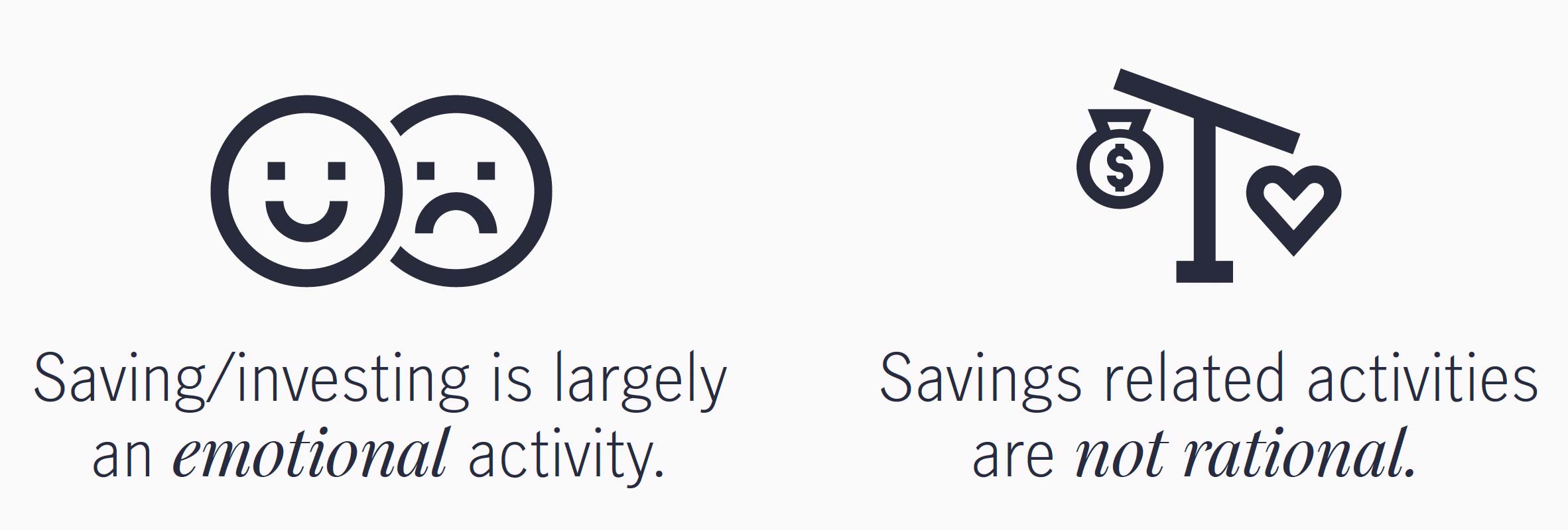
Knowing this, our goal was for Insights to help:
- Make finances a positive topic, or at least, not a negative one.
- Create the lightbulb moment where users understand the impact of their emotional decisions on the reality of their goals.
- Translate what users want to do, into what a saving strategy should be.
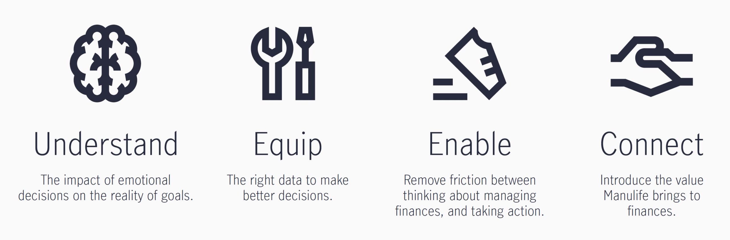
Design principles
As part of the design brief, we identified design principles to help guide experience decisions along the way.
- Tell me what is most important—I don’t want to be overwhelmed (prioritize)
- Help me understand the impact on my finances (educate)
- Let me know when something is out of the ordinary (inform)
- Give me insights relevant to my needs (personalize)
- Reduce manual management (automate)
- Identify when I’m doing well (motivate)
User goals
Rapid prototyping and testing
Design options
With the design brief and user journey completed, we explored three design options for the Insights experience. Each concept had similarities but also differed in unique ways. They varied from a conservative approach to a more radical implementation. The rapid prototypes were completed in Balsamiq and I used Invision for clickable prototypes.
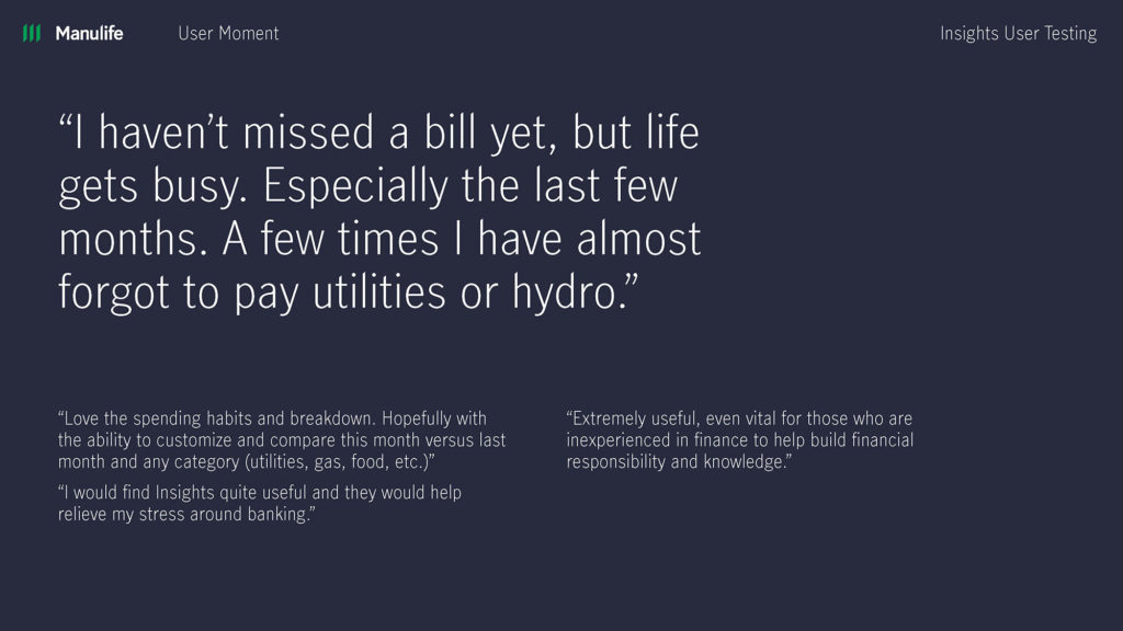
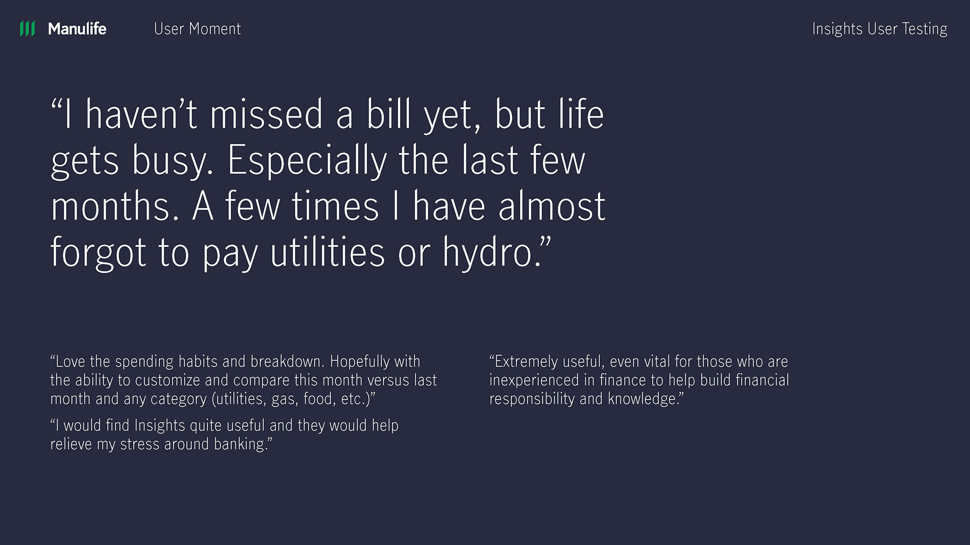
We recruited Manulife employees and ran remote moderated testing sessions to capture live feedback from Manulife Bank customers. We coupled that with unmoderated Userzoom recruits. Userzoom allowed us to quickly gather lots of feedback from mobile banking users. The combo of the two recruiting pools gave us a varied perspective that we used to inform the next design iteration.
Key findings
Ultimately we wanted to know which concept resonated with the target user. We came away with a few insights that helped inform the next iteration:
- Users don’t segment capabilities within the app. It’s all one experience.
- The faster and more accurately we can help users accomplish a task like paying bills, the better.
- Users respond positively to insights that help avoid problems (fees, missed payments, etc).
- Users didn’t always respond positively to insights in line with their transactions.
- Users often responded positively to a section of the site dedicated to Insights.
- Users were quick to be skeptical of related or suggested resources.
- Users further segmented insights in their own mind.
- Trust is key. When users believe that you’re focused on their best interests, buying will follow.
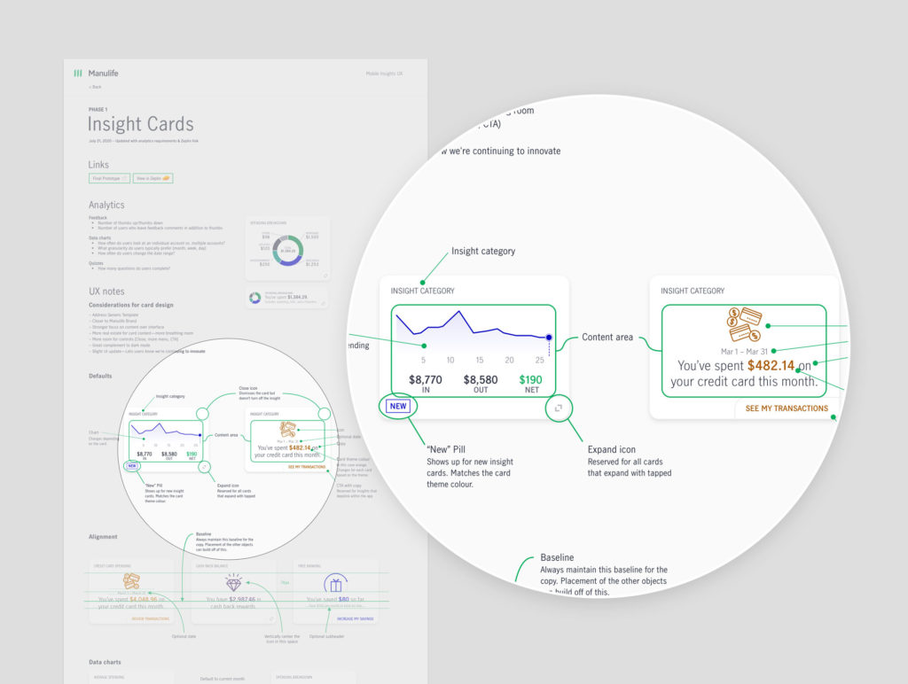
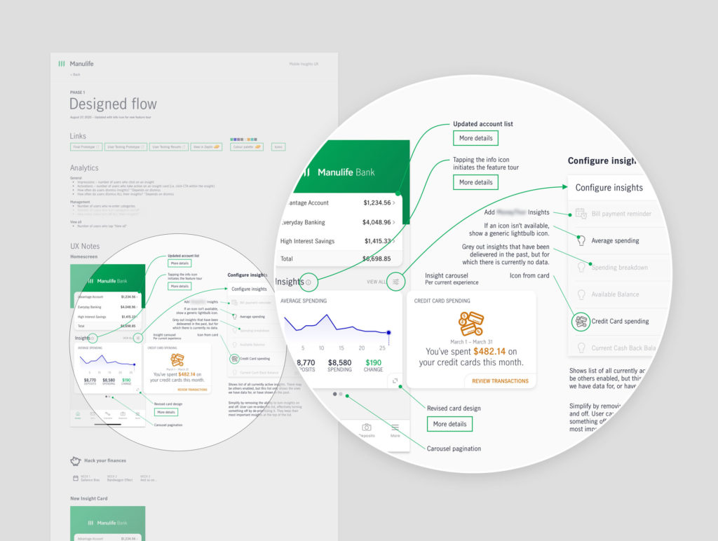
Finalizing designs
The next iteration took three concepts and combined them into one. We tested this version again before moving on to high-fidelity prototypes in Sketch. And just to make sure we hit the mark, we tested the hi-fi prototype one more time. This gave us an opportunity to gather feedback on which insights were most attractive and useful to customers.
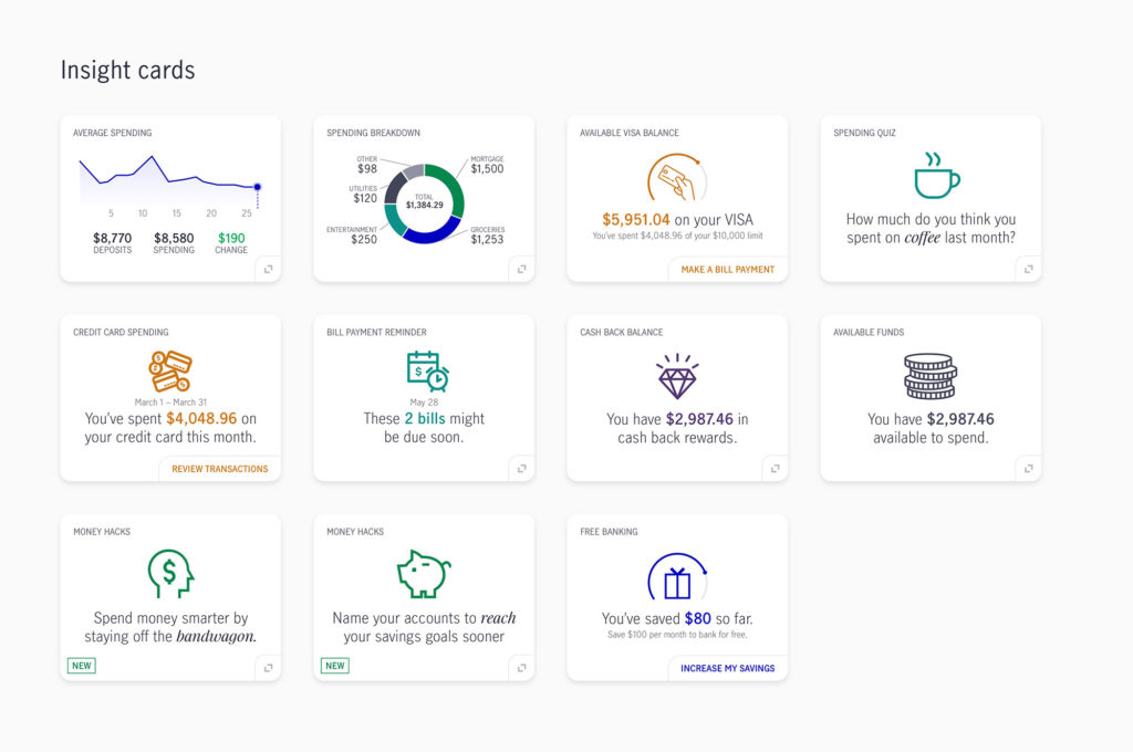
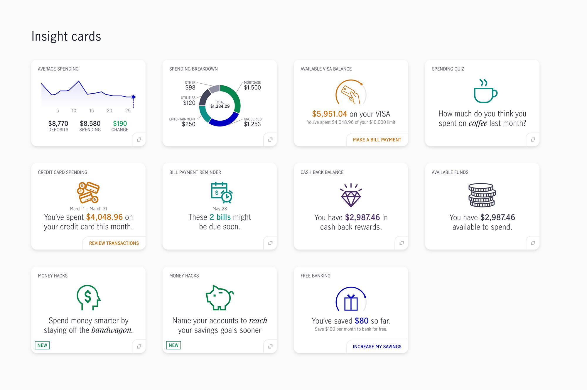
While we were designing the UI, we also ran a Userzoom study to see how users categorize and prioritize insights. We knew we only had resources to develop insights cards for the MVP release, and wanted to spend that time on the right ones.
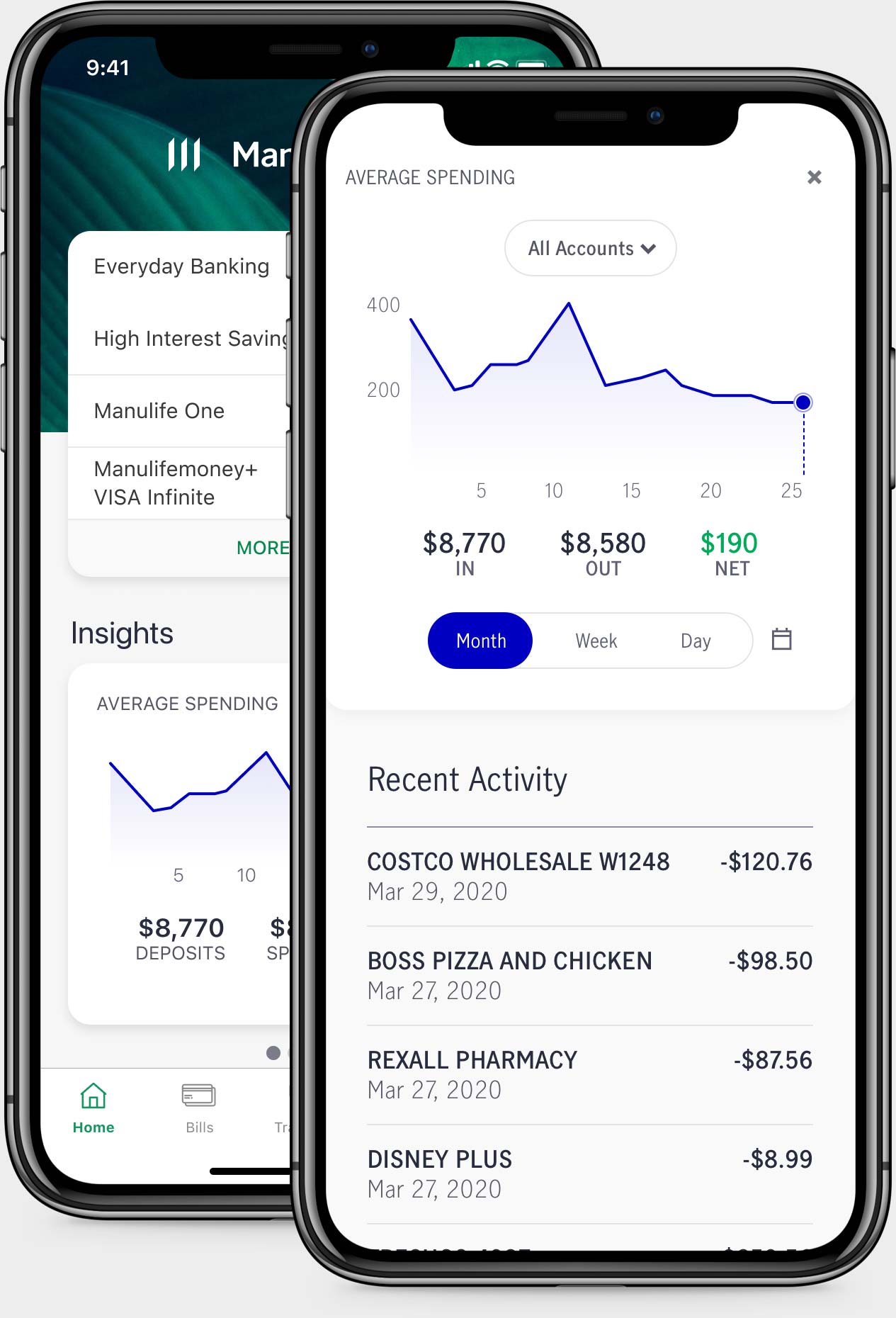
Solution
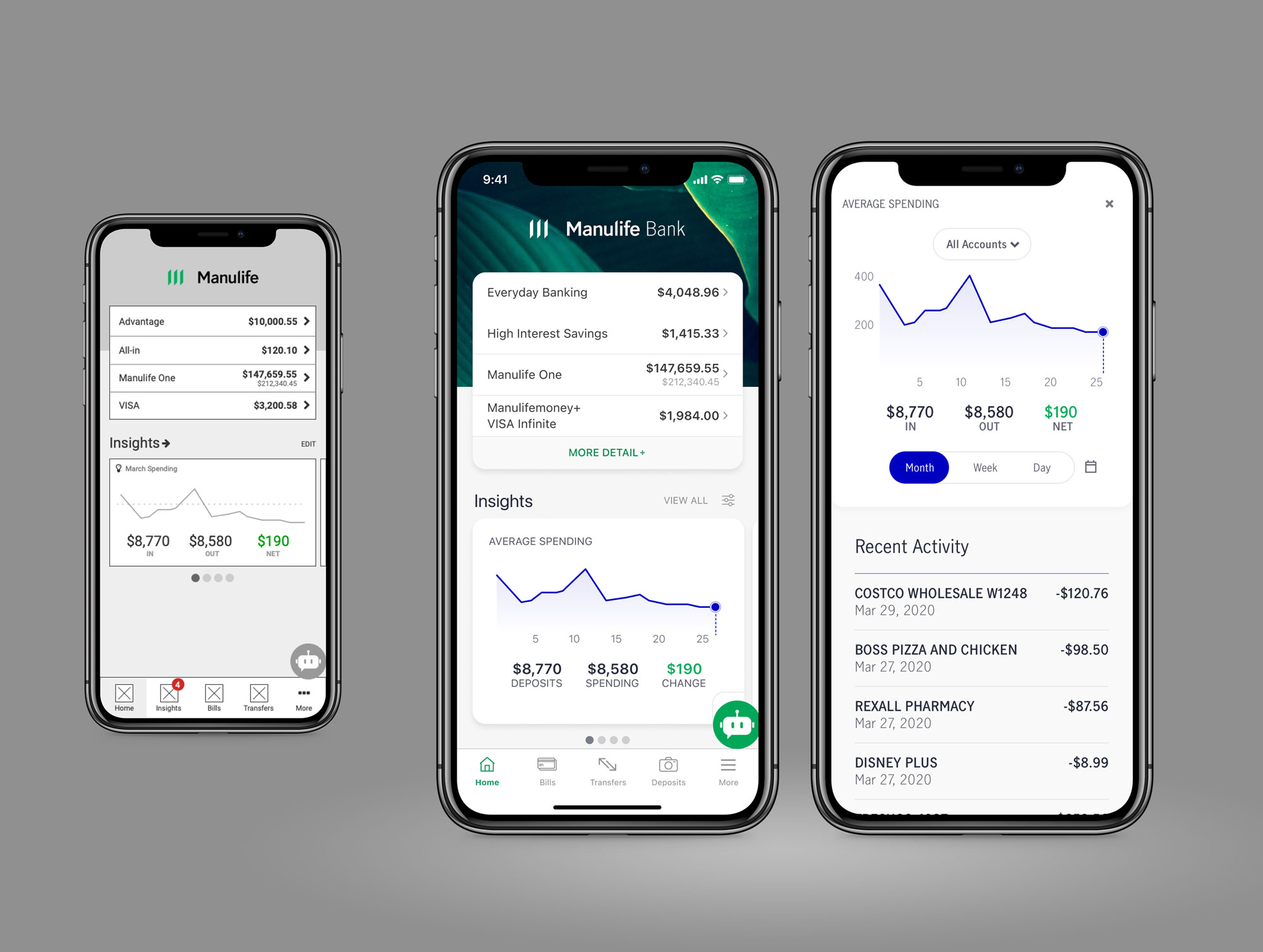
The feature was released to all customers with an initial set of insights and the plan to continue adding new ones as time went on.

Outcome
The thorough planning and testing of Insights helped set the stage for future design within the mobile squad. We learned a lot along the way.
- Customers started receiving an MVP list of insights to their app dashboard
- Customer engagement was high and we started receiving good feedback
- We released a campaign called “Money hacks” that identified unique ways to save money through behavioural economics
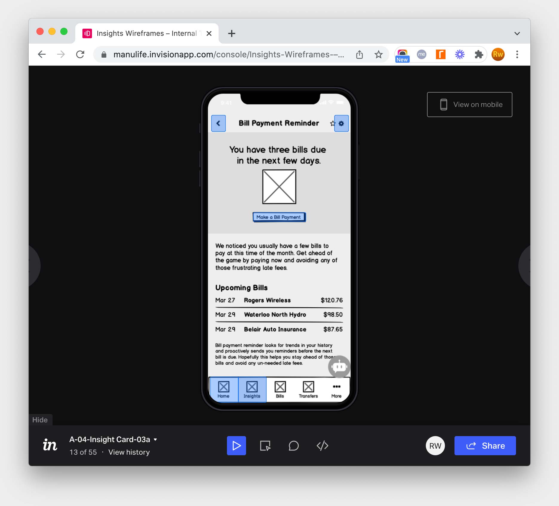
- We released an insight called “Bill payment reminder” that helped users avoid missing bill payments
Lessons learned
Priorities quickly shifted on the teams that supported Insights and we weren’t able to release new insights as quickly as hoped. This led to some negative feedback as insights grew stale. Because the insights are targeted, some accounts weren’t eligible—this added to the challenge. We pivoted to allow users to minimize or turn off Insights on their dashboard when needed. It reminded me how important technology and dev teams are in creating valuable experiences for users.