![]()
Challenge
We live in a digital world—life is mobile and fast-paced. Users expect the ability to quickly find the answers they are looking for at a time that is convenient for them. A digital savvy user base would prefer not to look up phone numbers, wait in queues, and authenticate with only a hope of having their question answered. The faster we can deliver answers in a meaningful and convenient way, the better for our customers.
Manulife Bank needed to replace insecure email communication with customers. The result was customers being asked to call the bank to authenticate and have their question taken care of.
Beyond the business requirements, a digital world can also mean a less personal world. Communicating with a digital customer base means making every effort to also be personable. Secure messaging creates an opportunity to provide meaningful help and communication with users in a personal way.
“I need answers to my bank or finance questions as soon as possible. I don’t have time to call in, nor do I want to. How can I ask a meaningful question and receive an answer to help me take action on my finances.”
Process
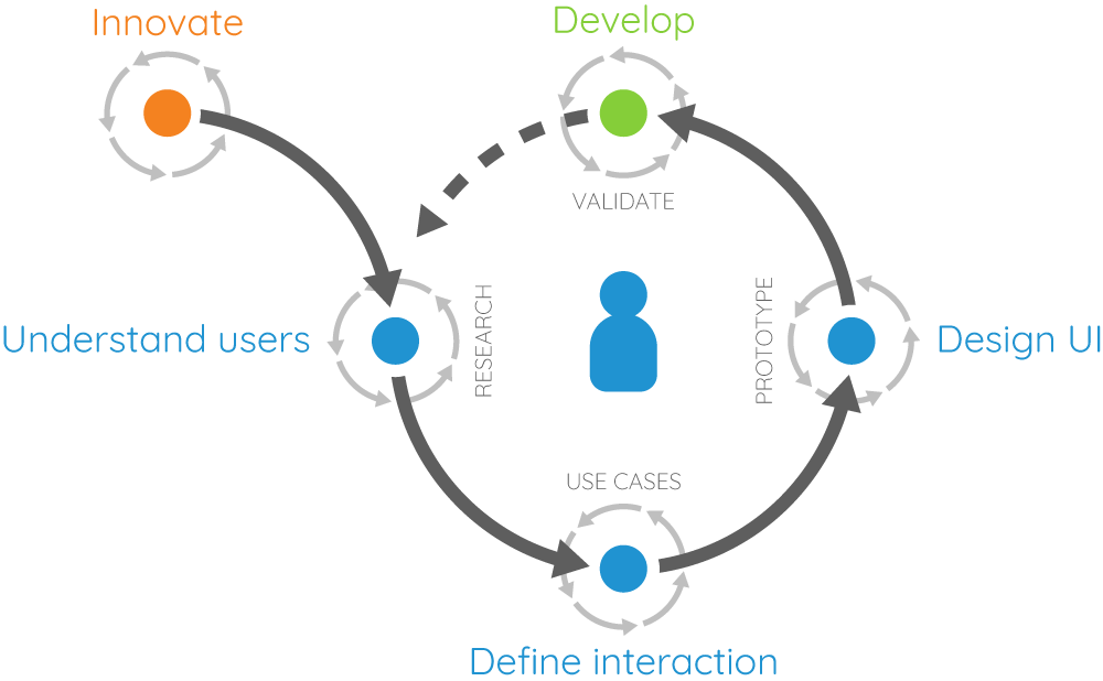
Following a similar process to other Manulife initiatives, we dove into the problem statement first.
- Determine the problem
- Define the experience
- Identify success criteria
- Outline the user journey
- Rapid prototype and test
- Finalize design
- Document
At key points throughout the journey, I met with the team to collaborate on ideas, gather feedback, and clarify direction. This ensured everyone understood where we were headed and why we were making particular decisions.
Design principles
The design principles became a key part of determining the direction of our experience. We explored a few options in early stages and ultimately trimmed down to one.
- Easy to ask a question over getting the question to the right team.
- Complement existing messaging patterns.
- Integrate with existing backend systems.
- Make sure it feels like you’re talking with someone over interacting with a machine.
Rapid prototyping and testing
Design options
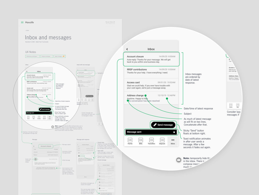
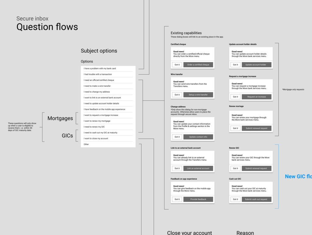
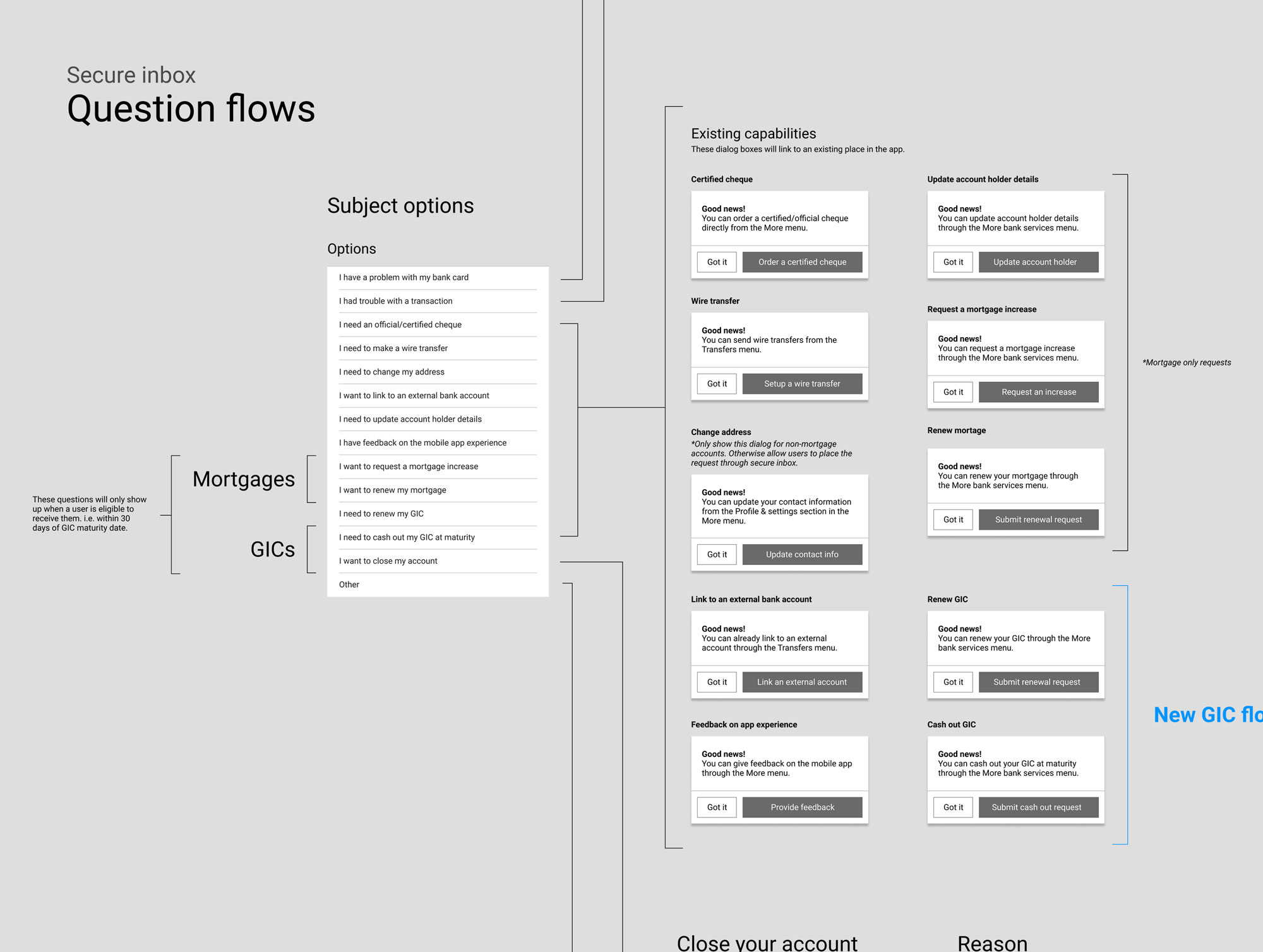
With the design brief and user journey completed, we explored two design options for the Insights experience. We wanted to make it easy both for users to submit questions, and for client service agents to classify the question, get it to the right person, and quickly respond.
Data became an important driver of the inbox experience. We connected with the call centre team to understand the types of questions they were receiving. We learned there were a small number of common questions. This meant users would type up their own version of those questions and then a client service agents would have to parse the various forms of the question and get it to the right team to answer. We decided to explore options that would automatically categorize and draft the message but also allow users to add additional information if needed.
Option 01—The wizard option
This option took users on a stepped journey to formulate their query. They would step through a series of screens that identified their question and pre-write their message.
Option 02–The inbox option
This inbox option reflected a typical email app, following patterns that allowed users to select criteria and draft their message in the same window.

“Complement existing messaging patterns”
Based on our design principles, we ruled out the wizard option. Building on the affordance of existing messaging platforms reduces the amount of learning our users needed to do in order to send a simple message.
We explored a texting style messaging window and ruled it out for similar reasons. Inbox is more like email than texting and we didn’t want to give the impression that users were live chatting with a call centre agent.
Testing
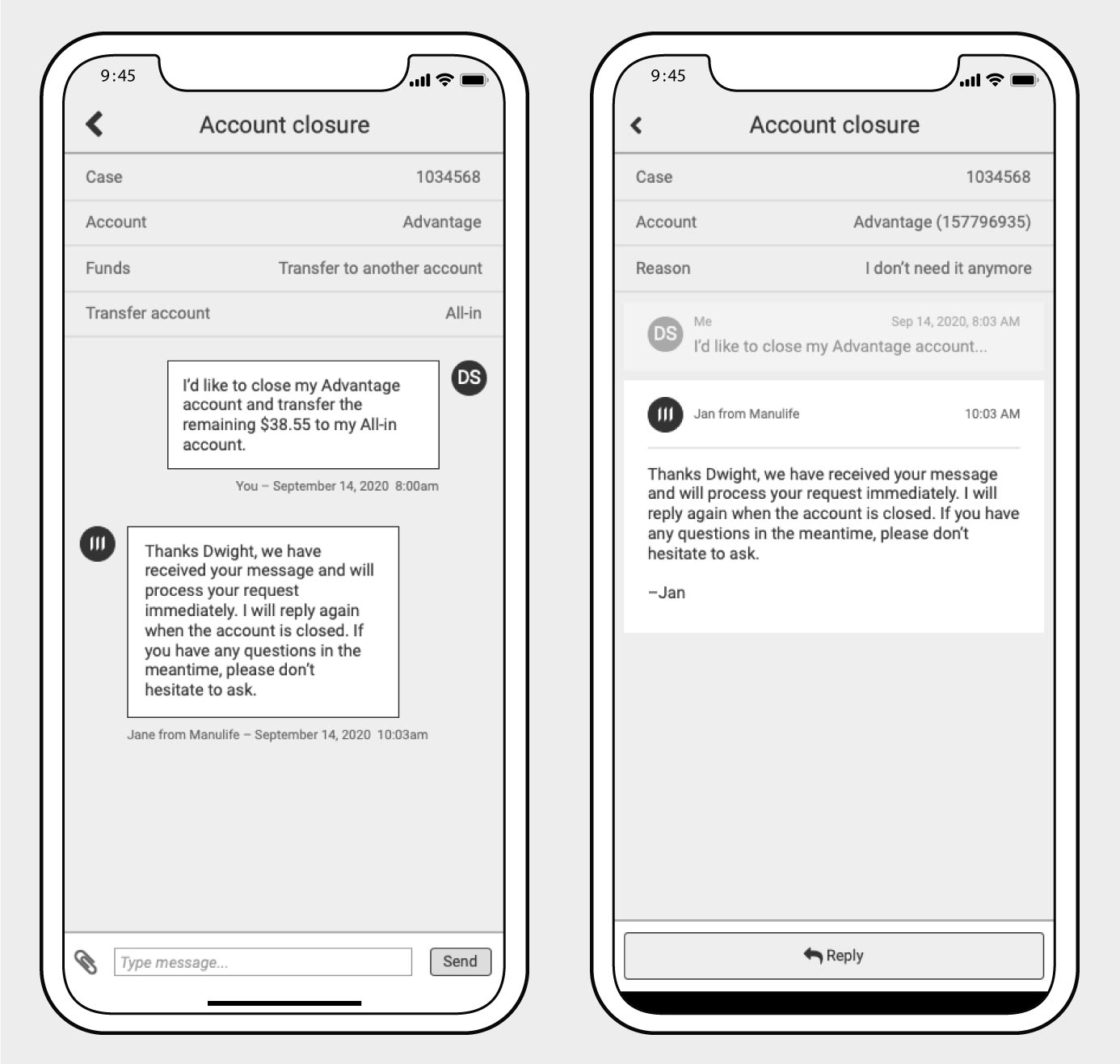
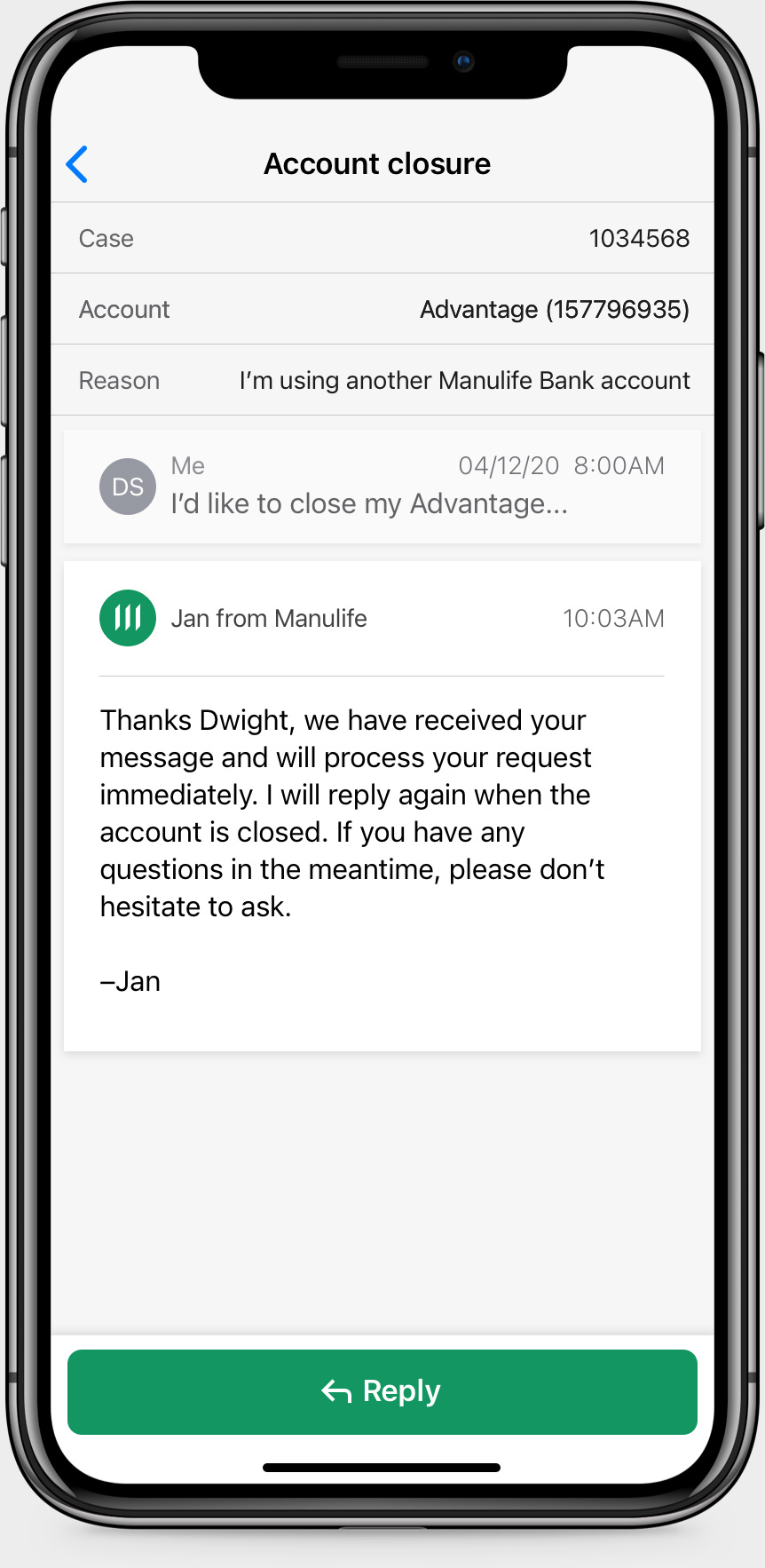
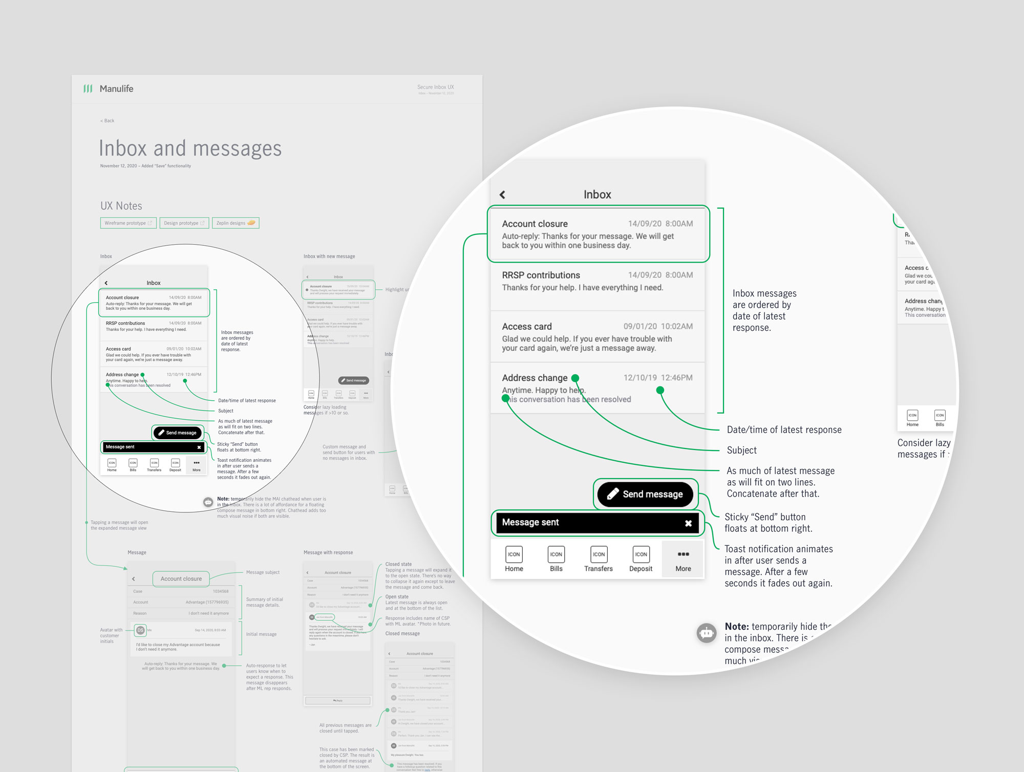
A unique feature of the compose message design is that it pre-fills a message for the user based on their category selection. This reduces the amount of work required to send standard messages, and also makes it easy for client service agents to parse the query. Our concern was that the auto-fill would confuse users, or that they wouldn’t realize they could still customize the message. So, we tested with Manulife customers and Userzoom recruits:
- Users were surprised that the message was filled out for them. But pleasantly. We received lots of great feedback.
- We also learned that our goal of complementing existing inbox patterns had paid off as users easily progressed through the flows without learning or trouble.
- Based on the message thread design, users also assumed they wouldn’t get an immediate response—which is exactly what we intended.
- We delivered on the “not like I’m talking to a machine” design principle by automatically adding the client service agent’s name to the thread. Users were initially worried that they would receive automated responses when submitting questions, but were happy and relieved when they saw it was an actual person on the other end. Relieved because they felt confident they would receive a meaningful reply.
Solution
It was great to see the feature released into the app and for users to start sending secure authenticated messages.

Outcome
This was a case study in data-driven design. Connecting with the call centre teams and understanding user needs through their eyes enabled us to design and deliver a unique solution that is streamlined for users and the business.
On top of that, unauthenticated emails were reduced along with the resulting call traffic.